Honorable Mentions
Below are the old layouts I made with a small explanation why I eventually got rid of them.
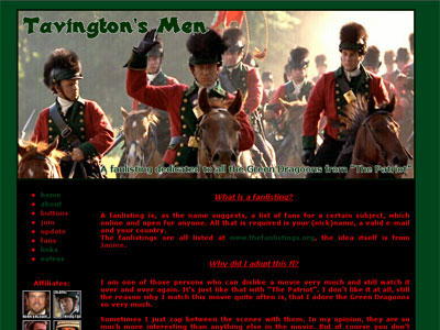
First Layout
I was getting tired of the intensive green and the black / red contrast. It also was time for a new blend.

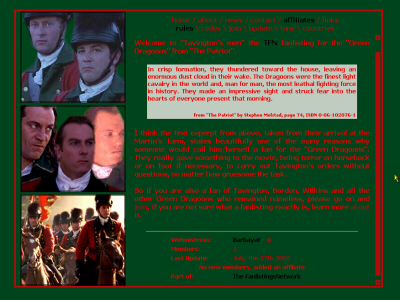
Second Layout
The background-color seemed to make reading too hard, it seemed blurry and unwelcoming. On top of that I wasn't entirely satisfied with the vertical main graphic. The blends did not work out the way I wanted them to.

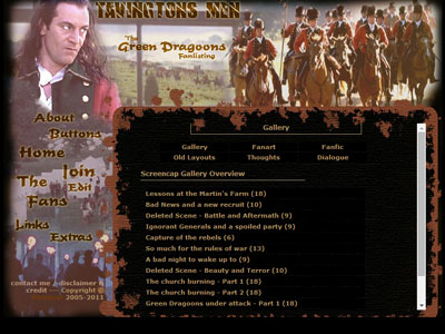
Third Layout
The background-color seemed to make reading too hard, it seemed blurry and unwelcoming. On top of that I wasn't entirely satisfied with the vertical main graphic. The blends did not work out the way I wanted them to.


